Projects
Current Projects
TESS Light Curve Analysis
Overview
The main task of this project was to manually analyze the 3912 light curves retrieved from recent TESS missions. The raw light curves were processed through various pipelines written by Dr. Buzasi and his team. From there, they were analyzed manually to filter out the ones that needed to be redone. This method was chosen so we can use this dataset as the training set for deep learning and machine learning models that are currently being developed.
What are Light Curves?
Light curves are the plots of light intensity of stars as a function of time. Using light curves, in the context of this project, can help us determine eclipsing binaries, transiting exoplanets, and solar spots. Fig. 1, for example, demonstrated a typical "good" light curve.
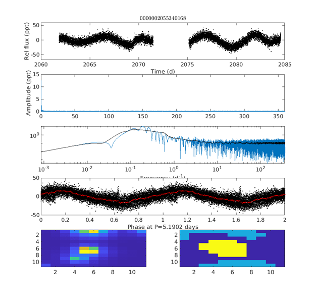
How To Read Light Curves
The top panel is the raw light curve for a typical TESS target star. Usually, several sectors are separately normalized and stitched together (note the gap between the two sections of the top panel in the figure) though in Fig. 1, we have the downlink gap for a single sector.
The second panel shows the amplitude-frequency spectrum of the light curve from the Lomb-Scargle pipeline. For most stars with signals dominated by rotation, the peak will be on the left since those periods are typically longer than a day.
The third panel displays the second panel on a logarithmic scale. The fourth panel is the light curve phased using the highest-amplitude peak. The corresponding period is noted on the x-axis. Overlaid in red is the same data, binned to the 0.01 phase to make it easier to pick out any trend(s) from the noise.
There are two images in the bottom panel. On the left is the original “postage stamp” TESS field for the target star. On the right is shown the aperture masks used to produce its light curve. Here the yellow pixels are the target star's aperture, the light blue areas were used to estimate the background, and the darker blue pixels were unused.
In this star, there is periodic behavior suggesting rotational modulation. The TESS “postage stamp” shows the target star (colored yellow) is not centered in the extraction mask set by the pipeline and that the sky extraction mask is contaminated by a background star. In our visual inspection of over 3900 images, this would be flagged for “redo” and sent back to be redone by the pipeline.
One of our project goals is to provide a learning set based on visual inspections of such light curves and extraction masks for a machine learning-based algorithm that can improve the selection of target and sky masks for automated extraction and assessment of light curves that can be applied not just to TESS, but also to Kepler and K2 data
Deep Learning
Overview
Machine learning is a subclass of artificial intelligence (AI) that can be trained to classify images. Deep learning is another subset of AI that goes beyond ordinary classification models and is modeled after how our brains function using artificial neurons, convolution layers, and activation functions like \(ReLU\) and \(tanh\).
The purpose of the code is to automatically classify light curves as “Redo” or “OK” based on human-input criteria and the raw image data. The code helps the computer learn to associate the structure of the pixel images with the human interpretation of what is “okay” or “not okay” and later applies it to light curves that have not yet been analyzed. The code took approximately two weeks to develop. There were two major steps to making the algorithm work:

- Data Preprocessing
- Model Developement
Image classification is often used to determine if an object (or objects) of interest is included in an image. We utilized this aspect of machine learning to determine if the TESS postage stamps (raw images) were good enough to be used in our tests of gyrochronology models. We adopted a Convolutional Neural Network (CNN) approach, which uses convolution layers to reduce the dimensions of the input pictures and effectively classify them. For both the machine learning and neural network, a class size of two (good or bad), and a dataset of size 2554 was used.
Preprocessing Procedure
The only preprocessing step we used in our assessment of TESS data was to zero-pad the images to a size of \(25 \times 27\) and normalization of the pixel data for both machine learning and deep learning models.
Section 1 \(-\) Postage Stamp Files \((X)\)
-
Import
.tar file in Python and use it to open TESS postage stamps. -
Extract TESS postage stamps to a folder in the local directory in
.txt format. -
Open the said directory; use a loop to parse through each postage stamp
.txt file and write their contents to a combined.txt file. - Load the combined text file and assign it to a Pandas dataframe.
- Using the comma as a delimiter, split each row so that each value occupies its cell.
- Fill the rows that have no values with zeroes. Those zeroes represent the boundary where one postage stamp ends and the other one starts.
- In a for loop starting from the first entry \((i = 0)\), count the number of rows until the first “zero” row is reached \((j = i + n_1)\). That number is stored, giving the dimensions of the first postage stamp.
- Zero-padding of the postage stamps is done to ensure that it is the same size as the largest postage stamp \((27 \times 27)\); otherwise, machine learning packages do not work with uneven data.
- Iterate the index, where the first entry of the second image has the same index as the final entry of the first image, offset by one \((i = j+1)\). The number of rows is again counted until the next “zero” row is reached \((j = i + n_2)\). That provides the dimensions of the second postage stamp. Zero-padding is also done in this iteration and on all future iterations.
- The same process is performed for all 3912 postage stamps, using that loop.
- After padding all postage stamps, convert the resulting dataframe to a NumPy array (for Decision Trees, Random Forest, Logistic Regression methodology) and a Torch Tensor (for Deep learning methodology).
- Split the \(x\) array and tensor into training and testing components, with a 20% testing size.
Section 2 \(-\) Light Curve Analysis Files \((y)\)
- Uploaded Excel file that features visual analysis of light curve quality.
- Convert string responses to integers. For example, a “Bad” light curve is assigned a zero (0) while a “Good” or “OK” light curve is assigned a "1"
- The same string-to-integer is done for all response variables, including Blends, Trails, Eclipses, Flares, etc., not just overall quality
- Switch/case statement inserted where user can choose their attribute of interest. Note that executing the machine learning algorithm on all response variables at the same time will lower prediction accuracy due to intercorrelation issues
- Convert the response column of interest \(y\) to a tensor (for Deep learning techniques) and a NumPy array (for standard Machine Learning techniques)
- Split the \(y\) array and tensor into training and testing components, with 20% testing size
Section 3 \(-\) Data Normalization
- Scale the data so that the minimum pixel value is zero. The absolute value of the pixel with the smallest value is added to all pixels in an image
- MinMax scaler performed so that the maximum pixel value is "1". Each pixel of an image is divided by the largest pixel in that image
Dataset
The TESS light curves, frequency plots, “postage stamp” images, and extraction masks for our wide binary components were visually evaluated by members of our group. Features such as flares, eclipses, blends, trails, discontinuities (optical/instrumental defects), sky mask problems, and aperture problems were flagged for each object. Also, targets were sorted into classes with apparent rotational modulations, pulsational modulations, or “inactive.” Those with specific problems were marked for "redo," and sent back for more careful extractions. An image set of 2554 stars were chosen, which was sorted into an 80%\(-\)20% split for training and testing, respectively.
Anatomy of the Convolutional Neural Network (CNN)
The input layer is 2D Convolutional (\(3, 16\)), with a kernel size of three and a hyperbolic tangent activation function. The first intermediate layer is also 2D Convolutional (\(16, 9\)), with a kernel size of three and a \(tanh\) activation function. The second intermediate layer is linear (\(6 \times 6 \times 9,\space 27\)). The linear layer is followed by a flattening layer and a \(tanh\) activation function. The output layer is linear (\(27, 2\)), where 2 is the number of classes.
We have constructed a CNN with the following parameters:
- Training set size: \(60%\)
- Batch size: \(20\)
- learning rate: \(0.01\)
- Number of Epochs (iterations through the data): \(100\)
-
Loss Function:
Cross Entropy -
Optimizer:
SGD
These hyperparameters need to be further tuned to increase model performance. On top of using accuracy as a main performance metric, other methods will need to be employed to make sure the model is performing optimally.
Model Developement
With the pixel data as the input, and one of the categories described above (called the labels, or classes). Along with traditional model training, K-fold validation was used to find optimal model performances.
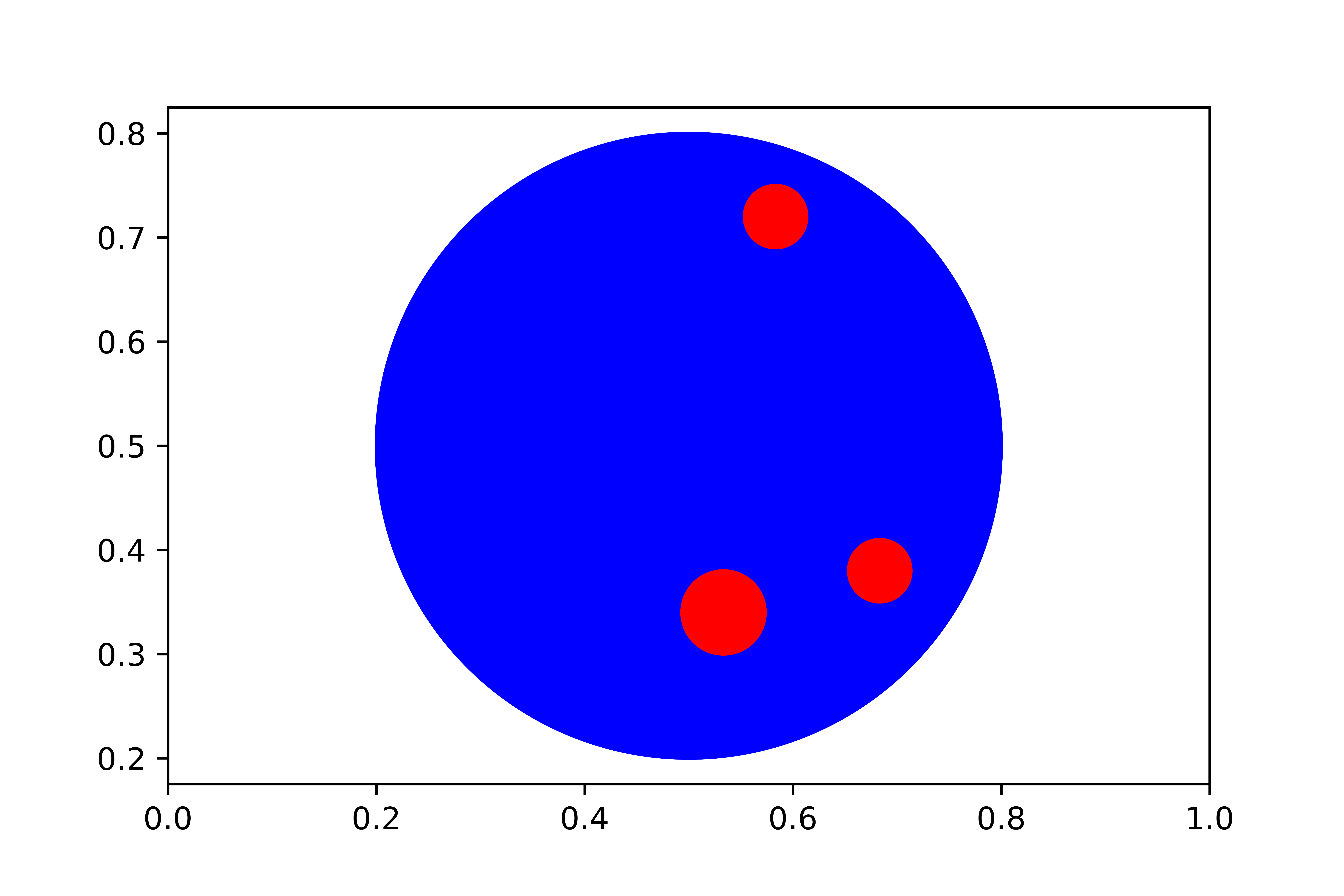
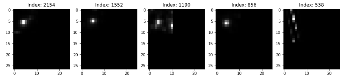
We used GradCAM (see Fig. 1), a tool to assist in the visualization of what the CNN sees. The dark blue pixels in a raw TESS image receive the lowest weight. As the colors in Fig. 1 approach red, the pixels' weight increases, which increases the likelihood that the model will choose that pixel to help make its decision. The final image in the right-most column is the raw image, which has been padded to a size of \(25 \times 27\) and has been transformed to a grayscale. For the false positive in the bottom row, the CNN saw more than one star blended into a single pixel, resulting in a decision of "good" when we visually had marked it as "bad."
Conclusions
Model Evaluations \(-\) Fall 2022
The main evaluation metric that was used was accuracy. In machine learning, accuracy is the ratio of correct predictions and is the most general evaluation metric. The plot below shows how the testing and training accuracies are related. Training accuracy is always higher than testing accuracy due to repetitively seeing the same data, while testing is done on data that has not been seen by the model.
The highest accuracy achieved by the CNN was 82% in epoch 60 out of the designated 100. This means that the CNN model accurately predicted the classification made by the human who inspected the image four out of every five times.
Periodogram Methods
Overview
The Continuous Wavelet Transform (CWT), Lomb-Scargle Periodogram (LS), and Auto-Correlation Function (ACF) are all techniques to analyze the periodicity in some signals. In terms of Gyrochronology, these analytic methods help to determine the rate at which stars rotate. By observing the surface of a star, the location of sunspots can be monitored and used to calculate the rotation rate. Although all three techniques should be practical in determining stellar rotation rate, their results can still differ. Therefore, this paper presents the best technique for determining the rotation rate of stars by using synthetic light curves. These synthetic light curves are designed from examining the movement of sunspots on both a 2D and 3D model of a rotating star.
Introduction
Continuous Wavelet Transform (CTW)
To accurately analyze signals that have sudden changes, we use a rapidly decaying wave oscillation called a wavelet. These wavelets have 0 means and exist only for a finite duration. To fit these wavelets to the signals, they can be scaled and shifted. A wavelet that is stretched helps capture the slowly varying changes in a signal, while a compressed wavelet captures the more sudden changes. Although the wavelet is stretched or compressed according to the type of signal, the wavelet also needs to be shifted onto the feature. The continuous wavelet transform obtains a time-frequency analysis of the signal, using analytic wavelets such as Morse or Bump Wavelets. The CWT outputs coefficients that describe the scale and shift of the analytic wavelets. These can then be seen throughout the following graphic.
Lomg-Scargle Periodogram (LS)
The Lomb-Scargle Periodogram is one of the best algorithms for detecting periods in discontinuous data. Discontinuous data is characterized as having unevenly timed portions missing from the set. As for the TESS light curves, due to the positioning of TESS relative to the star (along with its field of view), every star cannot be continuously observed. By using a Fourier-power spectrum analysis, the Lomb-Scargle can compute periods from a time-series set that may not be apparent.
Auto-Correlation Function (ACF)
The last time-series analysis algorithm used is the Auto Correlation Function (ACF). The technique of ACF is comparing the current value in a data set with either a lagged or future version of itself. Therefore, the algorithm can compute how the value changes concerning itself over time. Using this method can determine the period of a time-series data set along with the strength of this period. A drawback of ACF is that it expects values in order with equal spacing. However, due to TESS's nature, this is not always possible.
The 2-Dimensional Model
Before creating a 3D model, a less sophisticated 2D model was developed to fully understand the mechanisms behind producing an artificial light curve. The setup for the 2D model consisted of a main star, whose "light" would be monitored, and several sunspots. However, since the model was only two-dimensional, no rotation could occur. Therefore, the model worked extremely similar to that of a planetary transit, where the sunspot would start somewhere to the left of the star, move across the star, and then continue past it. This works in the same way as sunspots rotating into view, moving from one side of the star, and then disappearing as the star continues to rotate.
To determine the amount of "light" that was being received from the main star in every image, the total number of counts representing every star pixel needed to be added. However, how do you distinguish between star pixels, sunspot pixels, and background pixels? The star was given a blue color. Therefore, each image was converted to an array with pixel count values, and each unique color was identified. The proportions of each color to that of all colors were calculated. From there, the proportion that represented the color of the star was appended to a list from every image. These proportions were plotted versus the iteration/image number.
SARA Data
Overview
The Southeastern Association for Research in Astronomy Consortium (SARA), has two separate 0.9-meter telescopes in Kitt Peak, Arizona, a 0.6-meter SARA telescope in Cerro Tololo, Chile, and a 1-meter Jacobus Kapteyn Telescope at Roque de Los Muchachos on La Palma. The consortium was established in 1988.
The telescope at Kitt Peak National Observatory, Arizona, USA, is 2073 meters above sea level, with a 0.96-meter diameter primary mirror. The telescope in Kitt Peak is equipped with a German-style equatorial mount and first began research in 1965. The mount is operated with standard VNC/Radmin protocols to communicate with the computers. The telescope is equipped with a CCD system with thermoelectric cooling, which allows for the acquisition of photometric data of faint nearby stars, like the ones we are targeting in our research.
Our Work
Our team works closely with data from observers at the Kitt Peak and Chile telescopes, where we have collected photometric data needed to determine unresolved periodicities that were previously flagged from the data gathered from the TESS telescope.
Data reductions are being completed using a popular image-processing software in the Astronomy industry called Astro-Image J. After the images are calibrated and reduced, Python programs were coded by our team to produce light curves and determine periodicities using various period-finding algorithms like Auto-Correlation function, Lomb-Scargle, and 2D Wavelet Transformations.
Kepler, K2, & GAIA
Kepler and K2
With the Kepler and K2 work we have been focusing on image reduction to properly extract the data sets from the stars. The images are in their raw form, so we spend much of the time comparing sizes of capturing apertures and determining the most accurate ones for different images.
First, we start by calibrating the CCD Data, then work with photometry to select target stars and companion stars, lastly, we extract photometric data to obtain light curves so we can resolve periodicities. Sima has been heading this project, teaching Ahnika and Luca how to properly reduce the images and extract the photometric data.
From this data, we can extract the light curve for the target star, and pass this forward to the machine learning algorithms. Using the machine learning algorithms will aid with reducing the total target list so we can have a finalized list of targets that will need more investigation about their periods.
GAIA
GAIA is a mission by the European Space Agency (ESA) that gathers large swaths of data for long periods. Using the different GAIA data releases, one two, and three, we can analyze stars that we have targeted with the SARA or TESS data to see if the light curves match up.
Analyzing such data would add confidence that the data gathered with smaller time frames for the Kepler stars are accurate and that the light curve equations are successful. Requiring the equivalent GAIA identifiers, extracting the data from ESA, and using Period04 to perform a Fourier transform to extract a larger sinusoidal curve to find periodicities.
The acquired periodicities can then be extrapolated out to the dates for the SARA and TESS data, compared with the results of sinusoidal curves that have been determined from that data, which can clarify the accuracy. The ongoing project has been headed by Ahnika who has been working with Krystian Confeiteiro to create code to speed up the process.
Past Projects
Machine Learning
Overview
The purpose of the code is to automatically classify light curves as “Redo” or “OK” based on human-input criteria and the raw image data. The code helps the computer learn to associate the structure of the pixel images with the human interpretation of what is “okay” or “bad”, and later applies it to light curves that have not yet been analyzed. The code took approximately two weeks to develop. There were two major steps to making the algorithm work:
- Data Preprocessing
- Model Develeopment
Data Preprocessing
The Data Preprocessing stage was the most laborious. This was expected because a properly structured data needs to be fed into the algorithm for the Machine Learning packages to properly work. The initial requirement was to read the zipped image data, which were in postage stamps,
It was noted that images were not the same size since pixel count is a function of a star`s magnitude. The machine learning algorithm requires matching number of (dimensions) for all observations, otherwise it will not work. Dr. Buzasi recommended a solution that will not have a negative impact on the data called “2D zero-padding”. The code for 2D zero-padding restructures the dimensions of every single image so that each image matches the dimensions of the largest one and populates their new pixels with zeroes. The largest image had dimensions of \(27 \times 25\), meaning a total of 675 pixels. All images were restructured to have 675 pixels. For example, a \(2 \times 2\) matrix \([[1,2][3,4]]\) that needs to be 2D zero-padded to a \(3\times 3 \) matrix would look like \([[1,2,0],[3,4,0],[0,0,0]]\).
After zero-padding all image matrices, a reshape function in Python was used to merge the rows of each image so that there is one row per image and one pixel per column. For example, an image such as \([[1,2,0],[3,4,0],[0,0,0]]\) would now look like \([[1,2,0,3,4,0,0,0,0]]\). The reason for reshaping is because each pixel represents a “decision variable” that the machine learning code takes into consideration. In addition to that, each row must represent a unique observation (in our case, star). The shape of the resulting data matrix X is \(3912 \times 675\). Since Dr. Oswalt has analyzed the first 2554 stars on the list, X was reduced to a final size of \(2554 \times 675\) that would be fed into the machine learning code.
With the data matrix X now complete, a target array y which contains the “class labels” for each observation or star was needed. The machine learning algorithm would associate the data for each star with its corresponding class label. The target array y in this case is the Redo (X) column from Dr. Oswalt`s TESS Light Curve Analysis worksheet, with class labels “X” or “OK”. If the image needs to be redone by the pipeline, it is assigned a label X. If the image has good extraction aperture and does not need to be redone, it is assigned a label OK. Since the machine learning code does not work well with strings or objects, the labels were converted to integers. All labels “X” were set equal to 0 and all labels with “OK” were set equal to 1. The image data is now completely processed and ready to be fed into the machine learning algorithm.
Procedure
Section 1 - Postage Stamp Files \((X)\)
- Import the
.tar file in Python and use it to open TESS postage stamps - Extract TESS postage stamps to folder in local directory in
.txt format - Open said directory; using a loop to parse through each postage stamp
.txt file and write their contents to a combined.txt file - Load the combined text file and assign it to a Pandas dataframe
- Using the comma as a delimiter, split each row so that each value occupies its own cell
- Fill the rows that have no values with zeroes. Those zeroes represent the boundary where one postage stamp ends and the other one starts
- In a for-loop starting from the first entry \((i = 0)\), count the number or rows until the first “zero” row is reached \((j=i+n_1)\). That number is stored, which gives dimensions of first postage stamp
- Zero-padding of the postage stamps is done to ensure that it is the same size as the largest postage stamp \((27 \times 27)\); standard machine learning packages do not work with uneven data
- Iterate the index, where the first entry of the second image has the same index as the final entry of the first image, offset by 1 \((i=j+1)\). The number of rows is again counted until the next “zero” row is reached \((j = i + n_2)\). That provides the dimensions of the second postage stamp. Zero-padding is also done in this iteration, and on all future iterations
- The same process was performed for all 3912 postage stamps, using that loop.
- Split the \(X\) array into training and testing components, with 20% testing size
Section 2 - Light Curve Analysis \((y)\)
- Uploaded excel file that features visual analysis of light curve quality
- Convert string responses to integers. For example, a “Bad” light curve is assigned a zero (0) while a “Good” or “OK” light curve is assigned a "1"
- The same string-to-integer is done for all response variables, including Blends, Trails, Eclipses, Flares, etc., not just overall quality
- Switch/case statement inserted where user can choose their attribute of interest. Note that executing the machine learning algorithm on all response variables at the same time will lower prediction accuracy due to intercorrelation issues
- Split the \(y\) array and into training and testing components, with 20% testing size
Section 3 - Data Normalization
- Scale the data so that the minimum pixel value is a zero. The absolute value of the pixel with smallest value is added to all pixels in an image
MinMax scaler performed so that the maximum pixel value is 1. Each pixel of an image is divided by the largest pixel in that image
Model Development
Four types of Machine Learning algorithms were employed, and their performance metrics were compared: K-Nearest Neighbor Classifier (KNN), Random Forest Classifier (RFC), Decision Tree Classifier (CLF), and Gaussian Process Classifier (GPC). In addition to that, one deep learning algorithm of the Neural Network type was explored: Multilayer Perceptron Classifier (MPC). Each machine/deep learning algorithm is a package that is imported from Python`s premier library for machine learning called scikit-learn. Before running the algorithms, image data for the 2554 stars was split into training and testing components, where 80% of data went to training and 20% went to testing. The computer learns from the training data and develops a classification model based on that. The model is then applied to the testing set, where the computer will predict the class label (0 or 1). Each model is then improved with a validation algorithm that optimizes the model so that it doesn`t overfit or underfit. A model that is too simple leads to underfitting (high bias), while an overly complicated model leads to overfitting (high variance).
The prediction accuracy metric was used to assess the performance of the models, which is the percentage of the testing set whose label was “correctly” predicted by the computer. By correctly, we mean the same as how Dr. Oswalt (or anyone assessing the light curves) would have labeled it. The prediction accuracies for KNN, RFC, CLF, GPC, and MPC are 77.9%, 82.5%, 78.2%, 81.1%, and 78.6%, respectively. Given these results it seems like the Random Forest Classifier algorithm, being more suitable for large datasets where interpretability is not a major concern, is the most suitable for this task. With an 82.5% prediction accuracy, human and computer would agree on approximately four out of five light curves whether their images need to be redone by the pipeline or not.
Results and Discussion
Sample image data coming from the pipeline is visualized on a pixel grid of size \(27 \times 25\) pixels in Fig. 6. As mentioned earlier, the images were originally not the same size because the number of pixels needed to construct a star's image depended on its absolute magnitude and angular size. Majority of images were size \(11 \times 11\) pixels. However, some ranged from size \(12 \times 12\) all the way to size \(27 \times 25\) pixels. This explains why so many extraction windows are centered on the top left of the grids. The zero-padding process explained previously ensured that all remaining pixels are populated with zeroes, in order to preserve consistency with size. The Machine Learning algorithm would not work unless all observations are of the same dimensions.
K-Nearest Neighbors Model Results
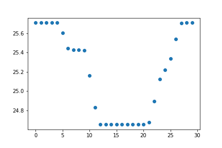
KNN is a non-parametric, supervised learning algorithm, with applications in both regression and classification. It uses proximity to make classifications or predictions about the grouping of an individual data point. The input consists of the k-closest samples in a training data set. The output is the class membership or class label. An object is classified by a majority vote of its neighbors, with the object being assigned to the class with the most K-nearest neighbors. For example, let's imagine a data point with some number of neighbors. Taking \(k = 10\) closest neighbors, we see that 7 neighbors have a class 0 and 3 neighbors have a class 1. Taking plurality vote, the KNN algorithm will predict a class 0 for our point.
Implementing the KNN algorithm is a relatively easy task. However, figuring out the optimal number of neighbors is not as straightforward. If we were to pick a very low number of K-nearest neighbors, the algorithm will not have enough training samples to learn from in order to accurately classify a point. As a result, the model will likely be overfitting to the few points in the training set. The training accuracy will be high because the model will easily learn from the small number of points, but the testing accuracy on unseen data will be low. If we were to pick a very high number of K-nearest neighbors, too much data will make the algorithm not generalize well. That will lead to underfitting, where both the training and testing accuracy will be low.
For a reliable model, a high testing accuracy is required. For this, we need the number of neighbors to be not too high or not too low. Figuring out the optimal number of K-nearest neighbors requires a process called K-fold Cross Validation (CV). The K-fold CV algorithm shuffles the data randomly, and splits it into a k-number of groups with an approximately equal size. Each unique group would act as a testing set, while the other groups will act as the training set. A model will be fit for each of those k-number of instances. As a result, there will be a total of k-number of models where each unique fold would be treated as a validation set while a model is fitted on the remaining 'k-1' folds. The model with the best number of K-nearest neighbors is the one yielding the highest accuracy. This ensemble of models is plotted in Fig. 2, with a computed classification accuracy for each number of K-nearest neighbors from 1 to 50. The model with \(K = 12\) nearest neighbors yields the highest performance, with a classification accuracy of 77.9%.

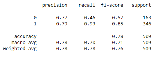
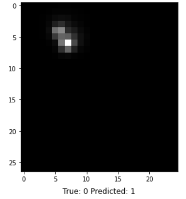
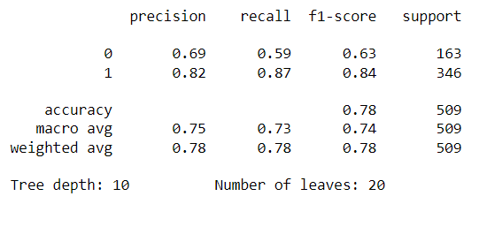
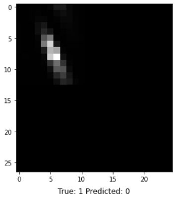
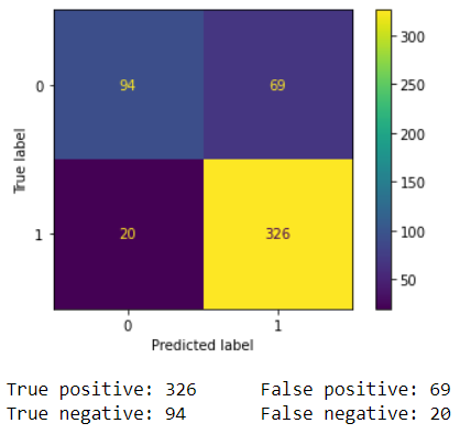
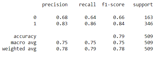
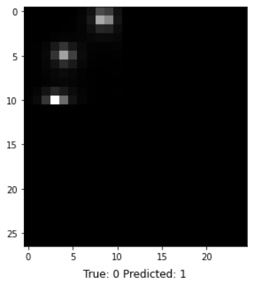
In addition to classification accuracy, there are other metrics that are important for assessing our model's performance. Those metrics can be obtained using a classification report from Scikit-learn, which builds a text report showing classification metrics such as precision, recall, F-\(\beta\) score, and support. Fig. 10 contains the performance metrics for the optimal KNN model. Precision is the ability of the classifier not to label a negative sample as a positive one. It calculates the ratio of true positives to the sum of true positives and false positives. Recall is the ability of the classifier to find all the positive samples. It calculates the ratio of true positives to the sum of true positives and false negatives. The F-beta score is essentially a weighted harmonic mean of the precision and recall, while the support metric is the number of occurrences of each class in y_true (actual target values). We can visualize cases where the KNN model did not correctly predict the class. As seen in Fig. 9, the model predicted a class of 1 (OK) for a random sample, but it was actually class 0 (Redo). The model unfortunately could not acknowledge that this star's image was blended with another star's. The model performance can be further assessed with a Confusion Matrix, as seen in Fig. 10. A confusion matrix is a table that is used to define the performance of a classification algorithm. It shows a count of instances with correct predictions (true positives and true negatives) and incorrect predictions (false positives and false negatives). The Machine Learning model output, unfortunately, contains more False Positives than False Negatives. This means that there are more light curves that were predicted as "OK" but are actually "Redos" than vice versa. For our purpose, we need more False Negatives because it would not hurt to redo a light curve that is already good. However, letting bad ones through would definitely hurt showing the gyrochronology age-period-metallicity relationship.

Decision Tree Classification Model Results
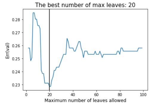

Random Forest Classification Model Results
The Random Forest algorithm consists of many decisions trees. It uses bootstrapping/bagging and feature randomness when building each individual tree to try to create an uncorrelated forest of trees whose prediction by committee is more accurate than that of any individual tree. Bagging is the process of randomly sampling subsets of a dataset over a given number of iterations and a given number of variables. These results are then averaged together to obtain a more powerful result. Bagging and boostrapping are examples of an applied ensemble model. An Ensemble model uses multiple models to train a dataset on. It averages the results of each model by ultimately finding a more powerful classification result. The Random Forest algorithm combines ensemble learning methods with the decision tree framework to create multiple randomly drawn decision trees from the data, averaging the results to output a result that often times leads to stronger classifications.
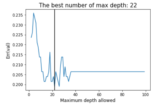

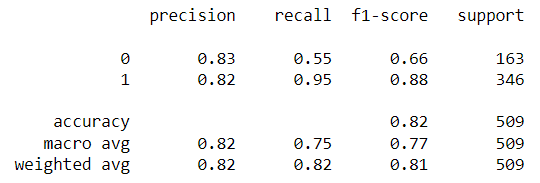
The main parameter of the Random Forest algorithm is the forest depth. Much like other algorithms discussed, a model with a larger forest might lead to overfitting due to the complexity of it, while a smaller forest might result in underfitting. For this reason, it is necessary to find the forest depth at which the model does not overfit or underfit using validation data. At that point, the testing error would be at its lowest. As seen in Fig. 10, a max depth of 22 yields the lowest classification error. A Classification report with all relevant metrics is shown in Fig. 11.

Multilayer Perceptron Classifier Model Results


Gaussian Process Classifier Model Results


MAST Image Comparison
Due to the nature of the TESS satellite telescope, we are not able to resolve binary star systems with a separation distance of less than 29 parsecs or less. For systems with this issue, we employ the MAST archive to determine separations of binary systems.
Website Development
Overview
The website was commissioned by Krystian Confeiteiro. The website was coded using a simple framework using Flask, HTML, CSS, JavaScript, and Python. There was a simple backend design that allowed for a dynamic build and a lot of content. The website was then deployed using Microsoft Azure which was directly integrated into Microsoft Visual Studio CODE, allowing for simple deployment and maintenance.
The website UI was designed by Krystian Confeiteiro, and the content was written by various group members based on their projects and contributions. If you have any questions about our work and would like to learn more, please do not hesitate to contact them by filling out the Contact form. You can also learn more about the researchers by navigating to the Researchers page.
Maintenence
This website is currently being maintained by Krystian Confeiteiro. If you have any questions, concerns, or suggestions, please fill out our contact form and we will get back to you as soon as possible.